Ramen Bar Website Redesign
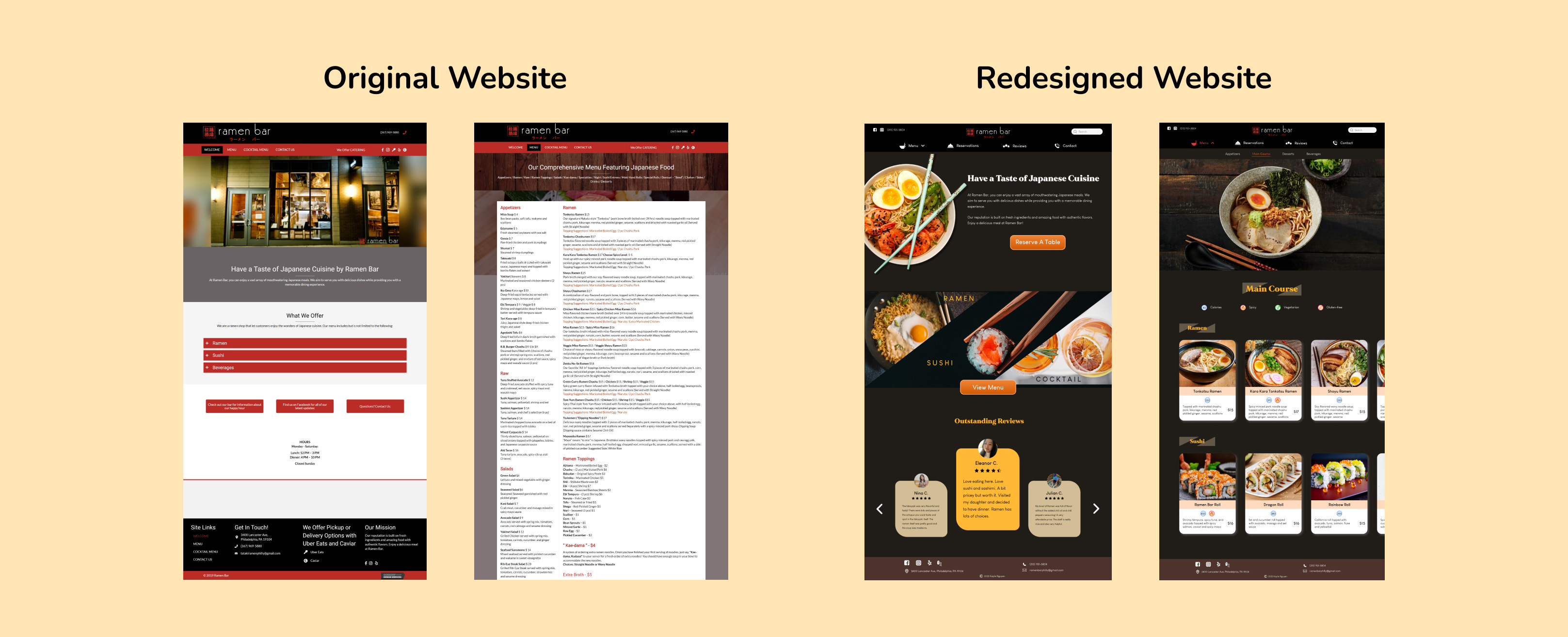
I redesigned Ramen Bar restaurant's disorganized and disengaging Menu page, and their unrecognizable Reservations function, which helped reduce their customers' frustration with making online orders and reservations.
Project
Self-initiated
Timeline
September - November 2021
My role
UI/UX Designer
Methods
Persona, Journey mapping, User interviews, Usability testing, Wireframing, Prototyping

Located in the heart of University City area, Philadelphia, Ramen Bar is a go-to restaurant for Drexel and UPenn students who are interested in Japanese cuisine. They are busy young people who prefer eating out - a more convenient and faster way to get food.
PROBLEM & RESEARCH
"Why is it so hard to View the Menu and Make a Reservation on a restaurant's website?"
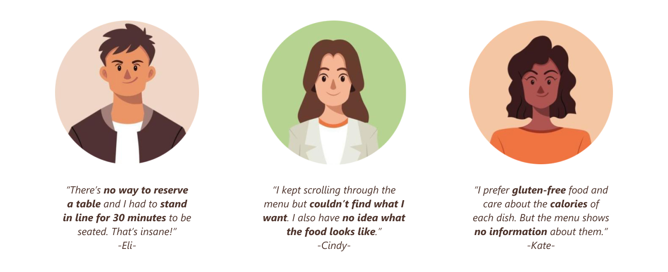
These are the two main tasks that most customers want to accomplish on a restaurant's website. However, based on my interviews with 6 frequent customers of Ramen Bar, they found it annoying to read the restaurant’s wordy menu and search for the Reservations function on the website, just to find out that it didn’t exist.
Looking into a typical customer’s journey, I realized that they experienced the frustrations… twice, after trying both dining in and online ordering. This is particularly off-putting to young customers, as they easily lose patience and don’t hesitate to find an alternative restaurant if they don’t get what they want immediately.
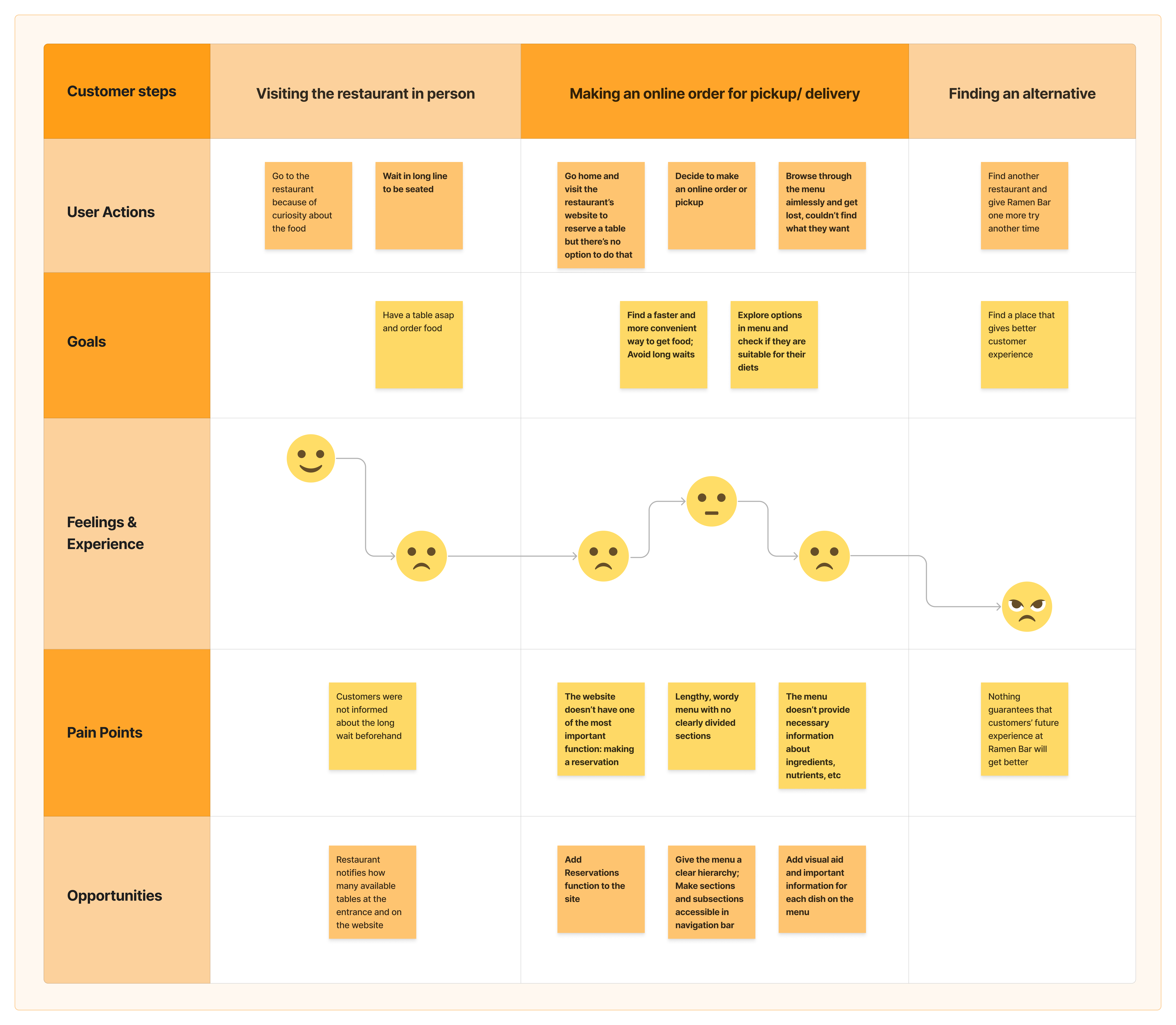
Understanding users’ pain points and where things go wrong in their process, I recognized how major and significant the problems were: they were detrimental to user experience with the website, and directly affected the revenue and reputation of the restaurant.
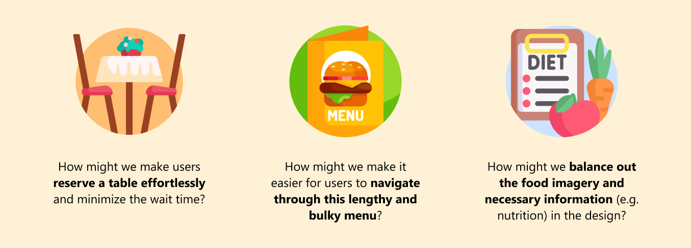
"How Might We..."
WIREFRAMING
Preliminary Ideas paved the way for Improvement
Applying my user research insights, I brainstormed some design solutions and tested them with the same users I interviewed. Their opinions opened up more insights I didn’t discover earlier, and gave me valuable design recommendations.
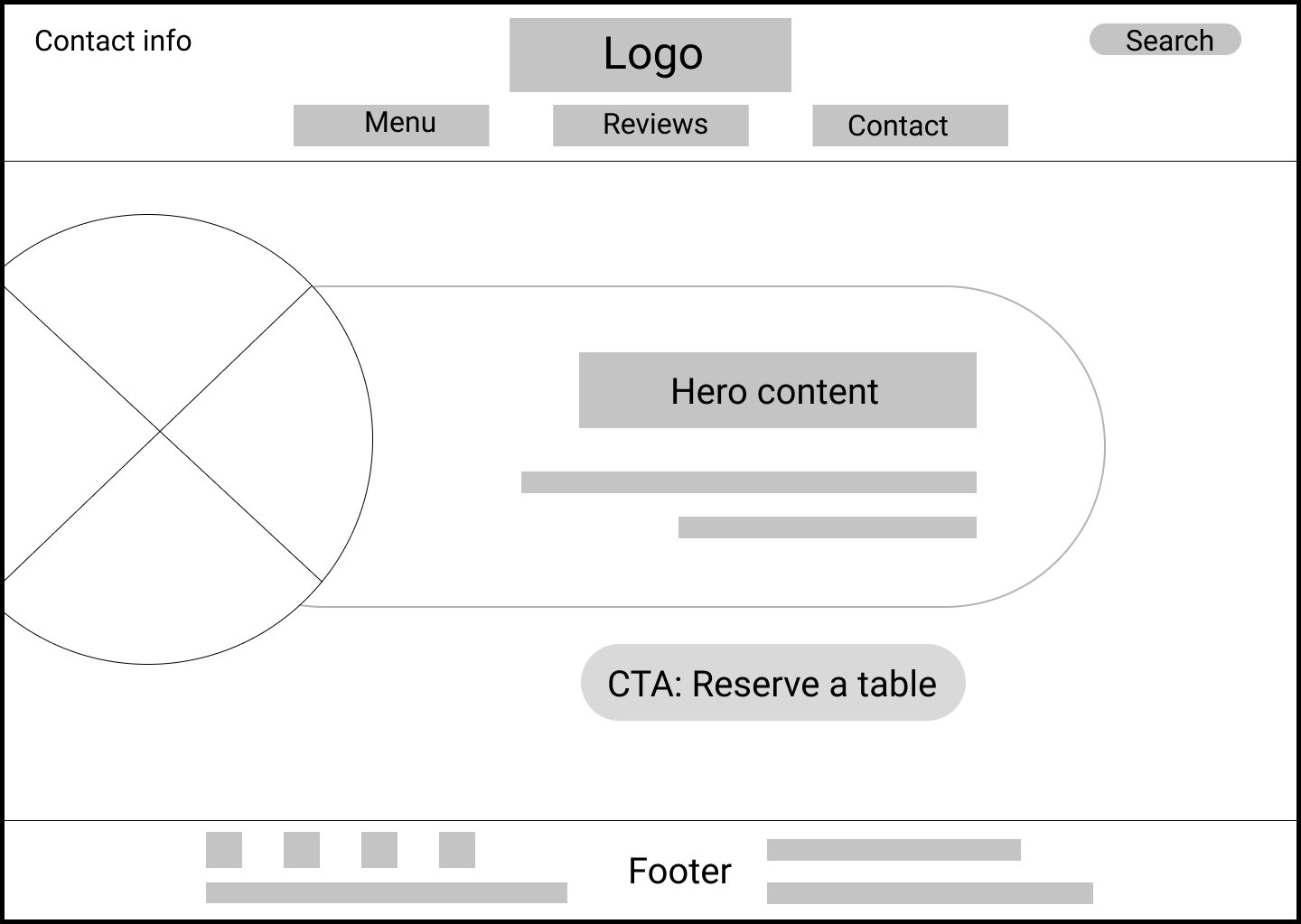
Design idea #1: "Make a Reservation" CTA in homepage
What users thought about it:
Having the “Reserve” button in homepage only is not enough. Many users decide to make a reservation after they go through the menu or restaurant’s contact information.
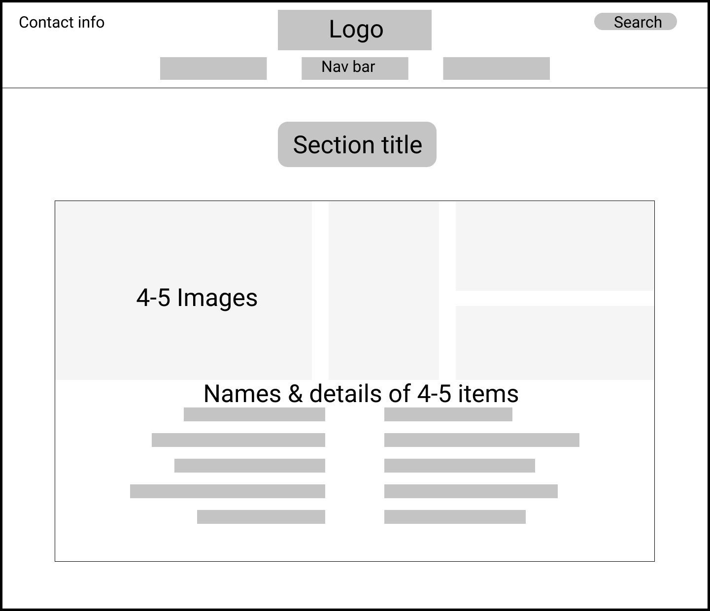
Design idea #2: Menu page - Group dishes into subsections
What users thought about it:
- Despite being divided into subsections, the menu is still a lengthy page that it takes users endless scrolling to reach their desired subsection.
- Images and information are separated, which can make users confused which image belongs to each dish.
SOLUTIONS
Refined Ideas: Better Solutions to User Problems
The design process wasn't linear. As I kept going, one problem was solved but another one might arise. However, each design iteration was a chance for me to understand the users better and refine my design.
After several iterations, in which I did usability testing for every design detail, I finalized some features that could solve website's aforementioned problems.
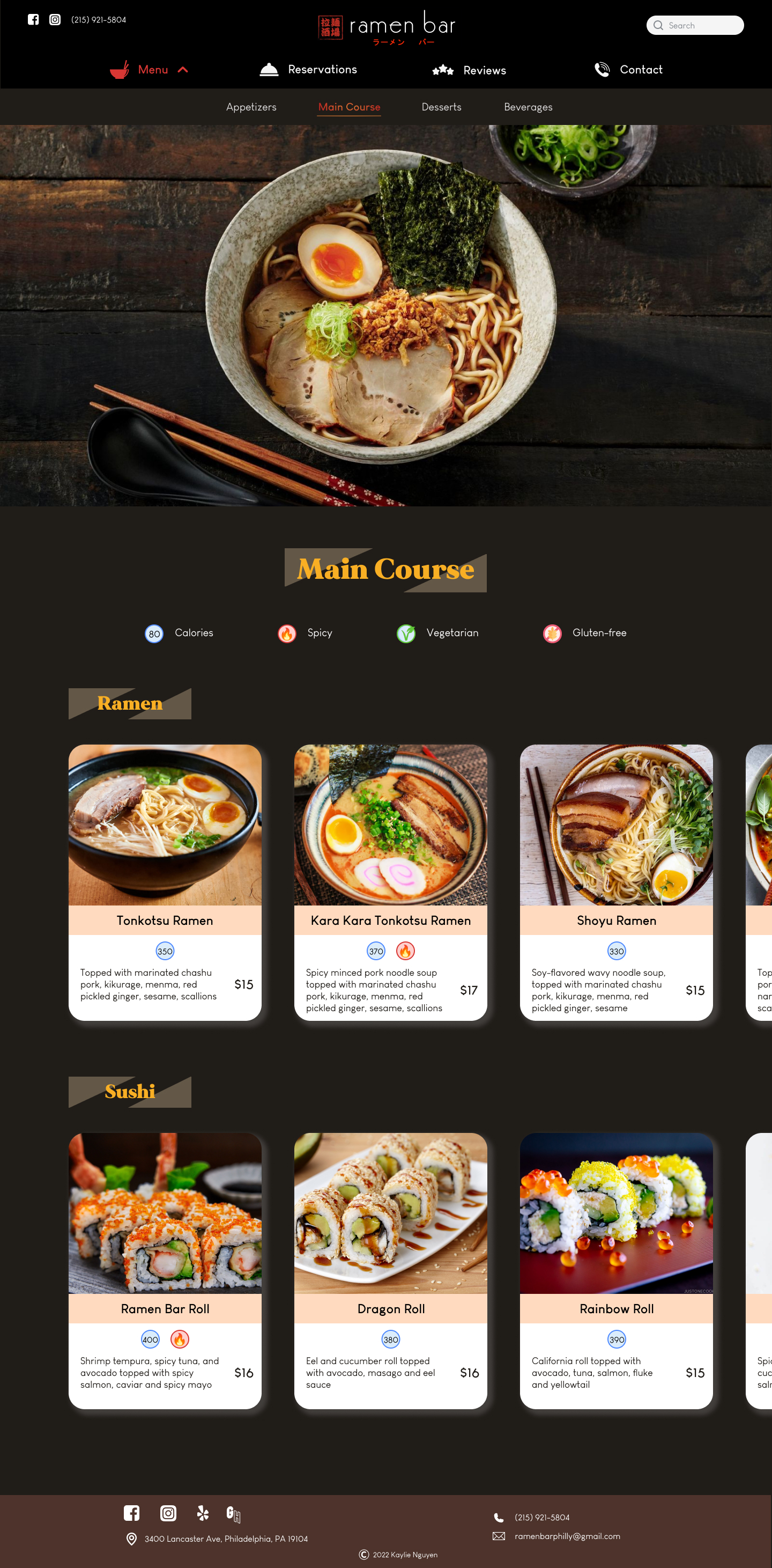
"Reservations" button in the navigation bar
Navigation bar shows up on every page and has a fixed position when scrolling.
⇒ The function is recognizable and accessible in every page
Clickable menu subsections and identifiable sub-subsections
- Have the subsections as a drop-down of the “Menu” button in navigation bar.
- Divide subsections into smaller sub-subsections (e.g. Appetizers > Soup/ Salad) and utilize horizontal scrolling.
⇒ Avoid endless scrolling
⇒ Restructure the page’s hierarchy
⇒ Users can jump to any subsection by clicking on the corresponding button on navigation bar
A dish = A card
Accompany each dish with its own image, and put them and the food detail into a “card”.
⇒ Clearly separate dishes from one another but still provide visual aid and necessary information.
VISUAL DESIGN
Visual Elements that helped Solved the Problems
Although the major problems were basically solved, I realized the user experience with the restaurant and its website could still be further improved by refining the visual design.
What wasn't going well?
- The original color scheme: mainly black, white, gray
⇒ Not inviting and appealing for a restaurant - Same font styles for every type of content
⇒ Unclear hierarchy of content
How did I fix it?
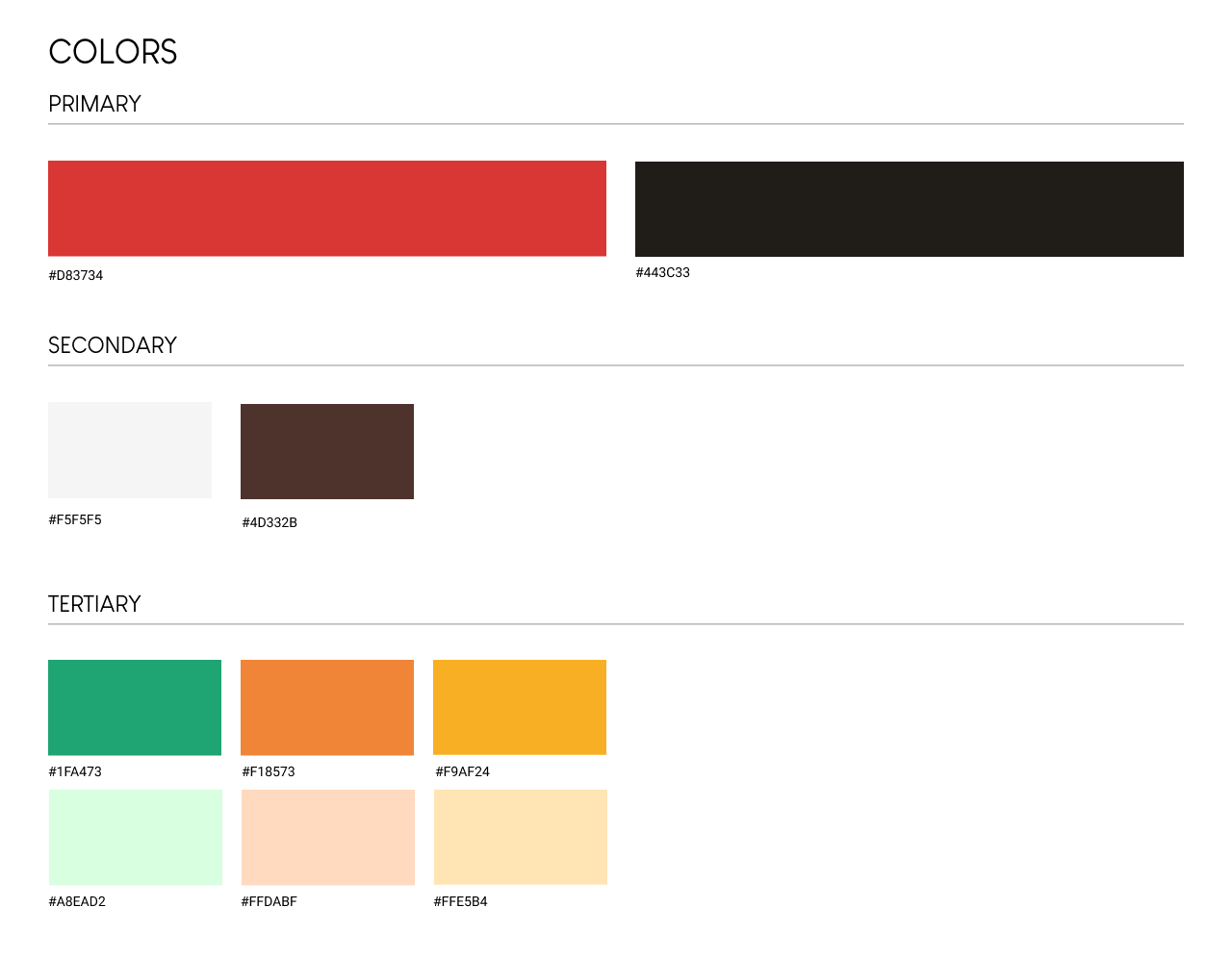
- Add new colors: yellow, orange, green - inspired by the image of sushi - to highlight important information
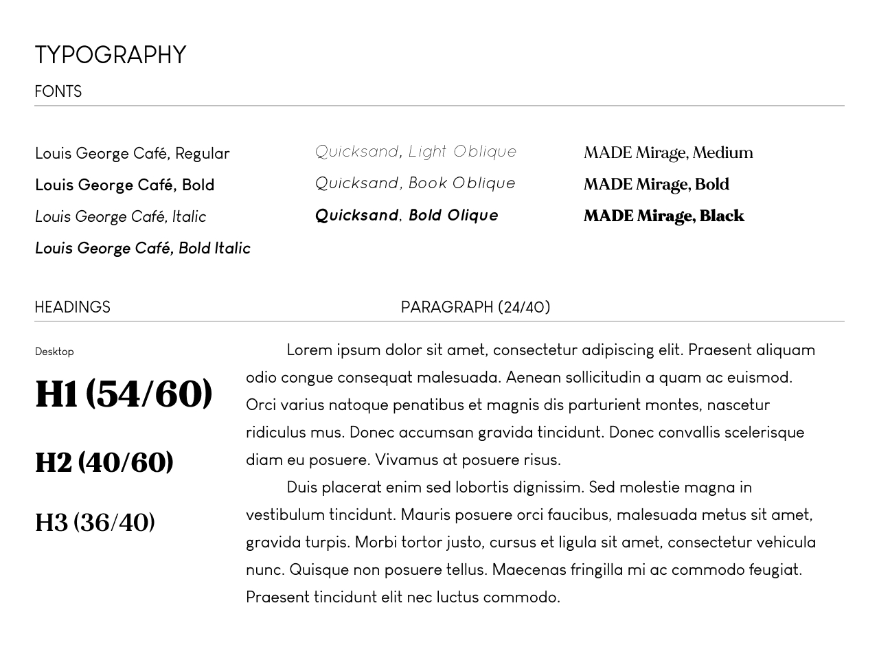
- Add different fonts/ font styles for different levels of content (headings, paragraph, etc)
What was its impact?
- New colors represent Japanese cuisine and bring a more vibrant atmosphere to the design
- New typography reorganize and categorize the content
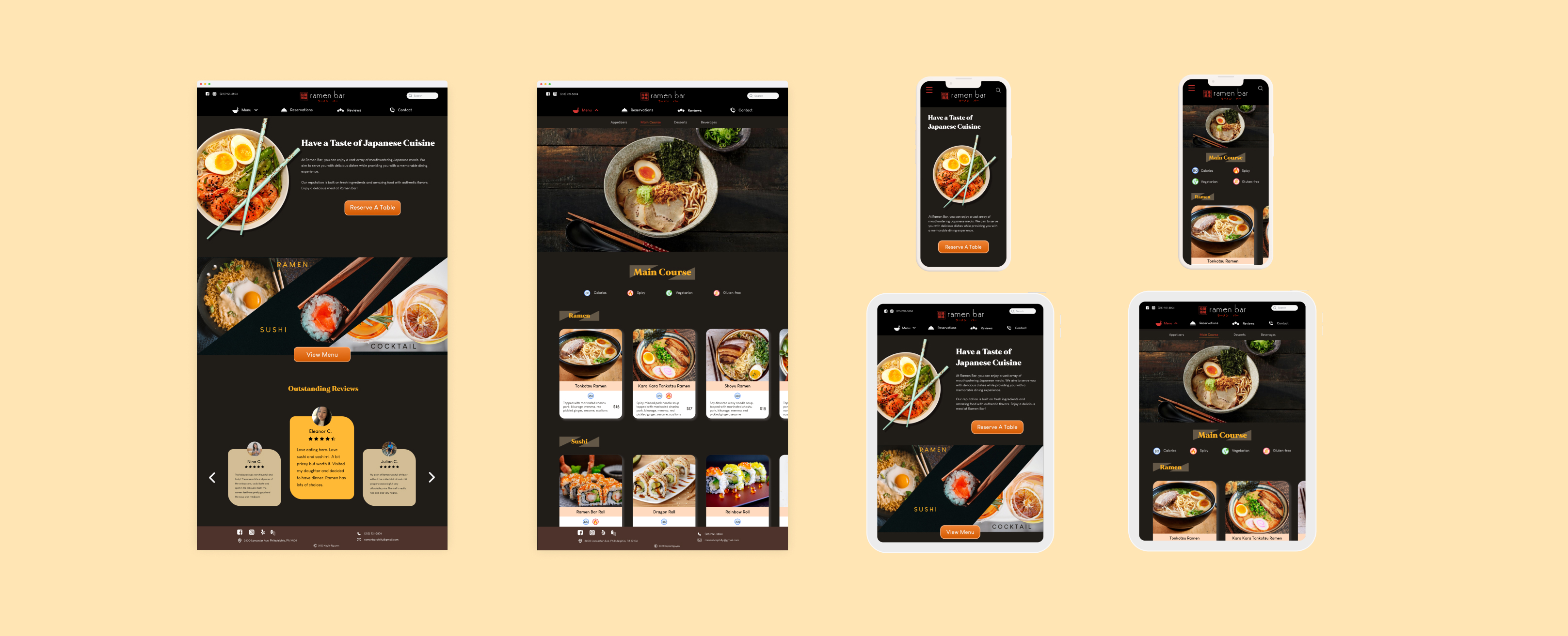
Final Design & Prototype
Redesigned Menu page
Redesigned Homepage
IMPACT
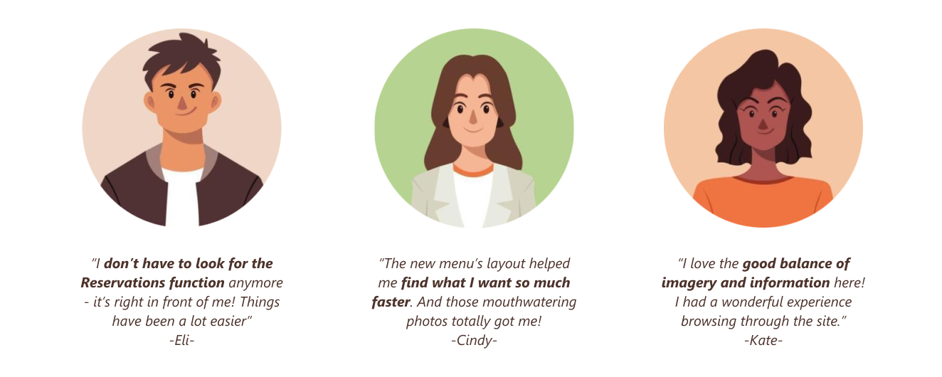
Users are now intrigued by the menu and can reserve a table in a second.
I asked for final feedback from users whom I was working with throughout the project to document the change in their opinions on the website.
All 6 of them recognized a huge improvement in visual design and content layout of the Menu page. They also left positive comments on the effectiveness of "Reservations" function.
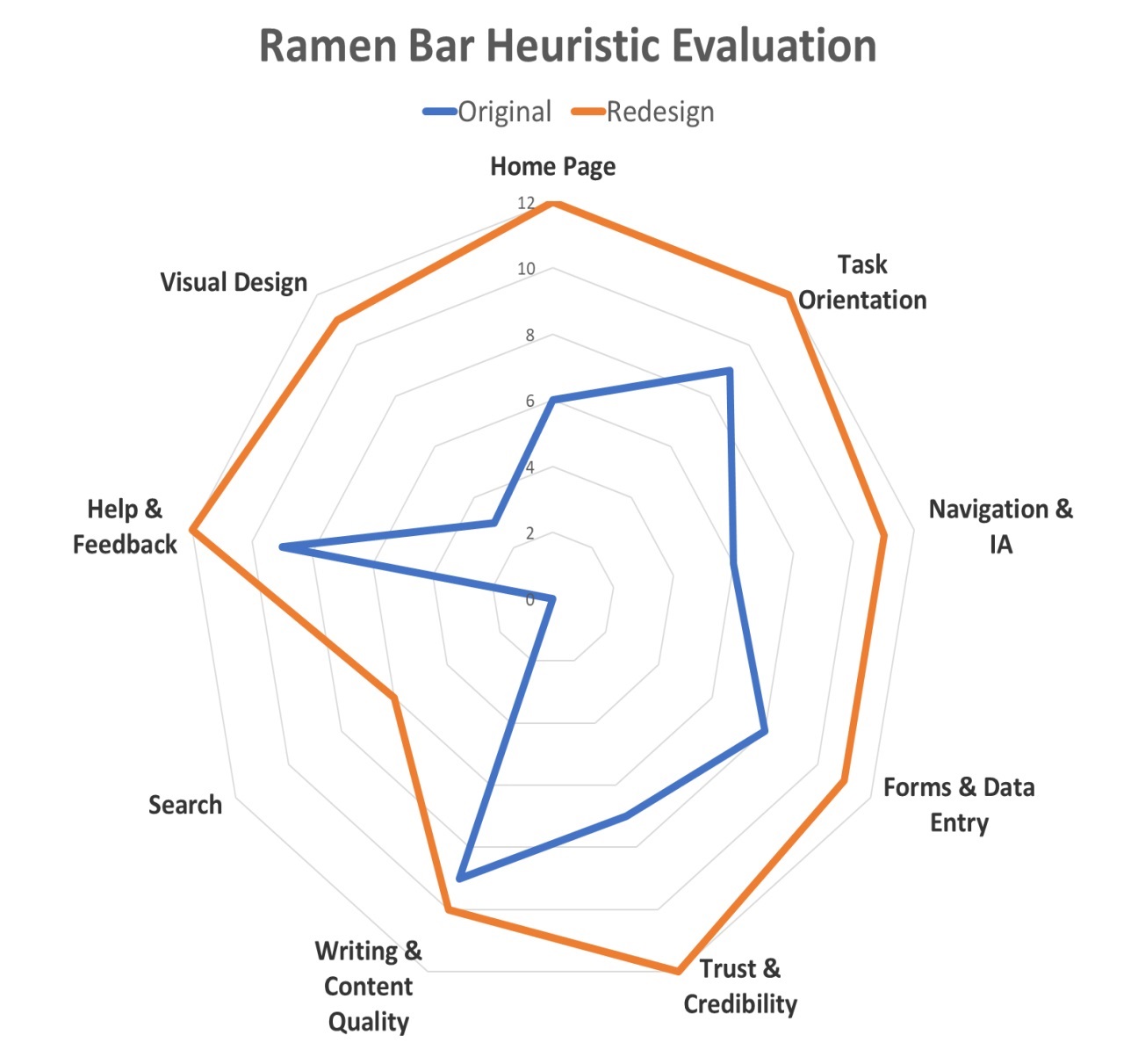
Through my first hands-on experience, I have learned the basics of UX design process: (conduct user research, design wireframes and prototypes). And my biggest lesson: Design for people, and with people. I have practiced not putting my assumptions or personal preference into the design process. I want to apply these lessons to the continuing project of improving this design and future projects in class and internships.
