Bubbly Music Streaming App
Using SoundCloud as my second streaming app, I have long noticed some design problems with its rigid page-to-page transitions that lowered my satisfaction with the product. I was wondering if there was any way to redesign and smoothen the app’s interactions, thus bringing a wonderful experience to the users.
Project
Self-initiated
Timeline
March - June 2022
My role
UI Designer
Interaction Designer
Methods
Persona, Task flow, App flow, Card sorting, Wireframing, Interaction Design
1. Analysis and Planning
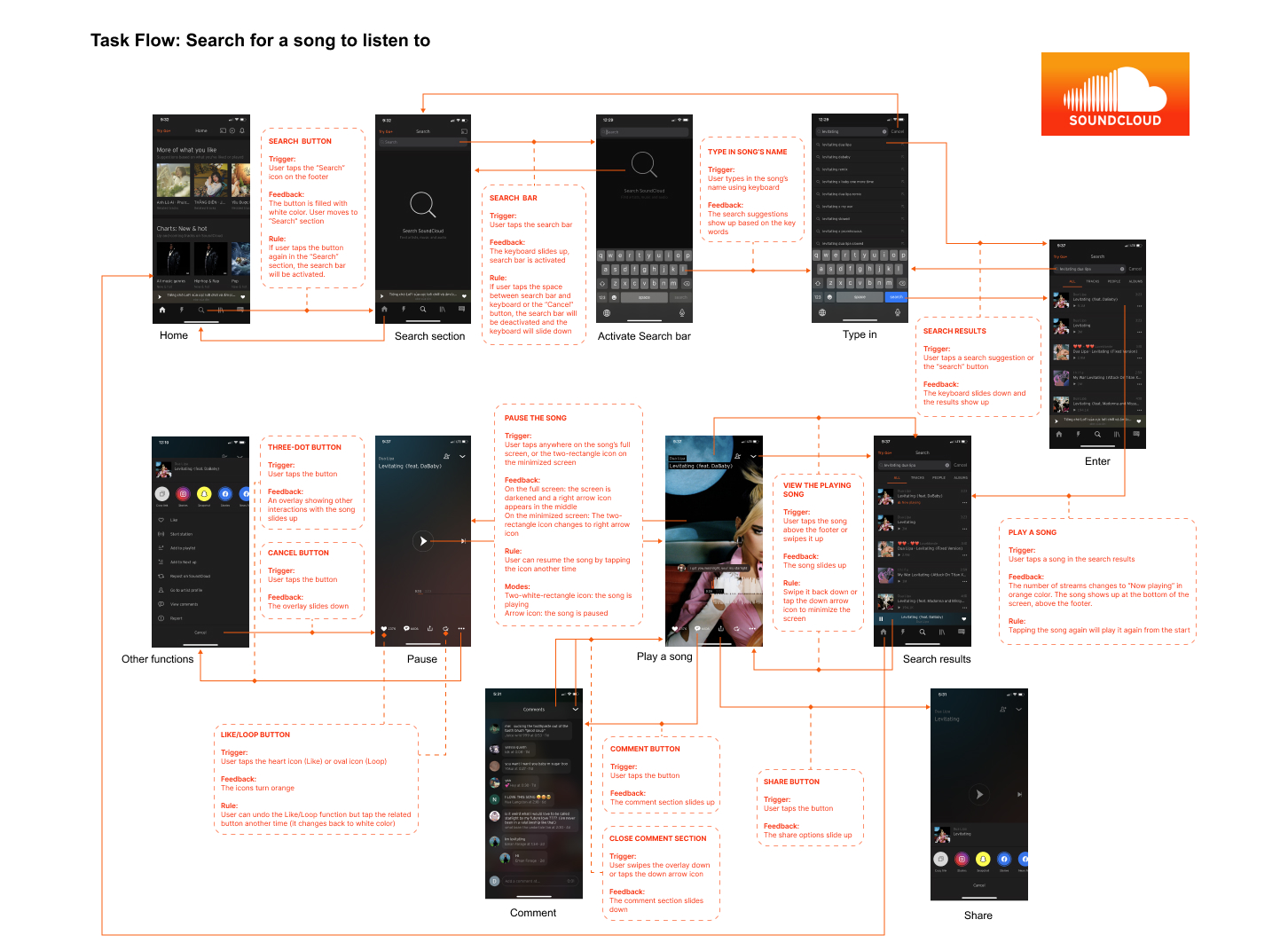
A redesign project always begins with an analysis of the original app. I created an app flow map illustrating the user’s journey when performing the app’s main user task: which button they hit first and then what’s next, what happens on the screen after each time pressing a button. Based on this flow, I evaluated SoundCloud’s interaction features as well as task flow: Does it take the users too many steps to complete the task? Are the microinteractions and animation smooth and “fun” enough to interest the users? The answers to these questions resulted in the project goals:
- Redesigning the interface to help users perform the task faster and more easily
- Adding more microinteractions and animations together with smoothing the transition between pages
2. Wireframe & App Flow
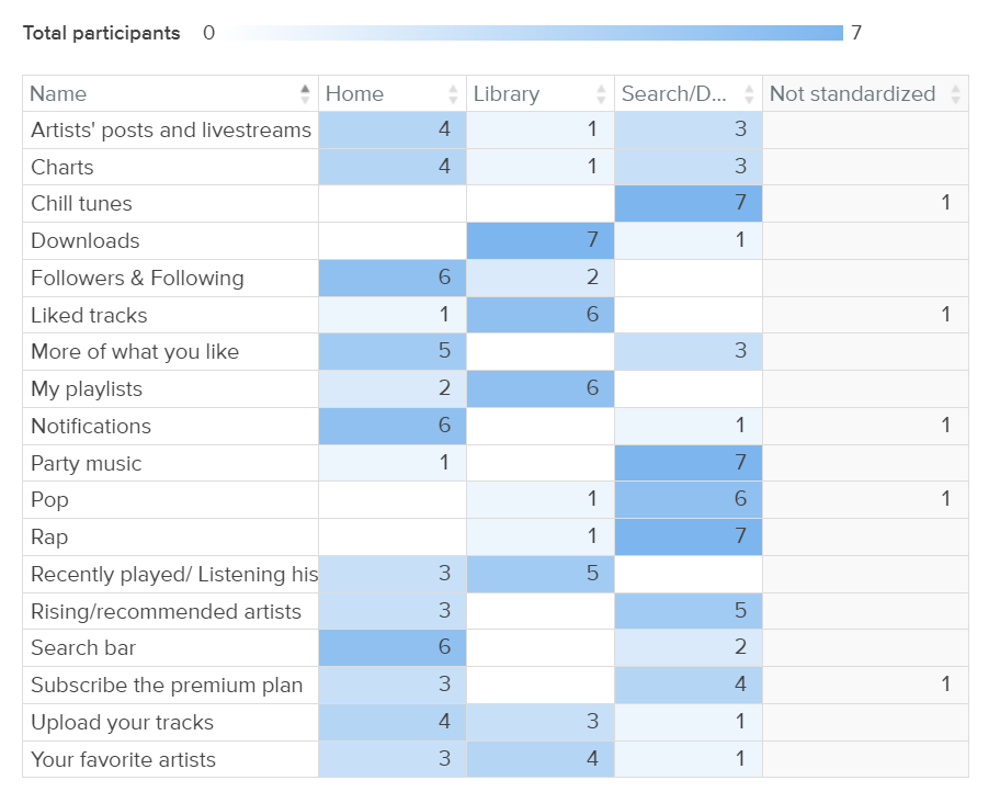
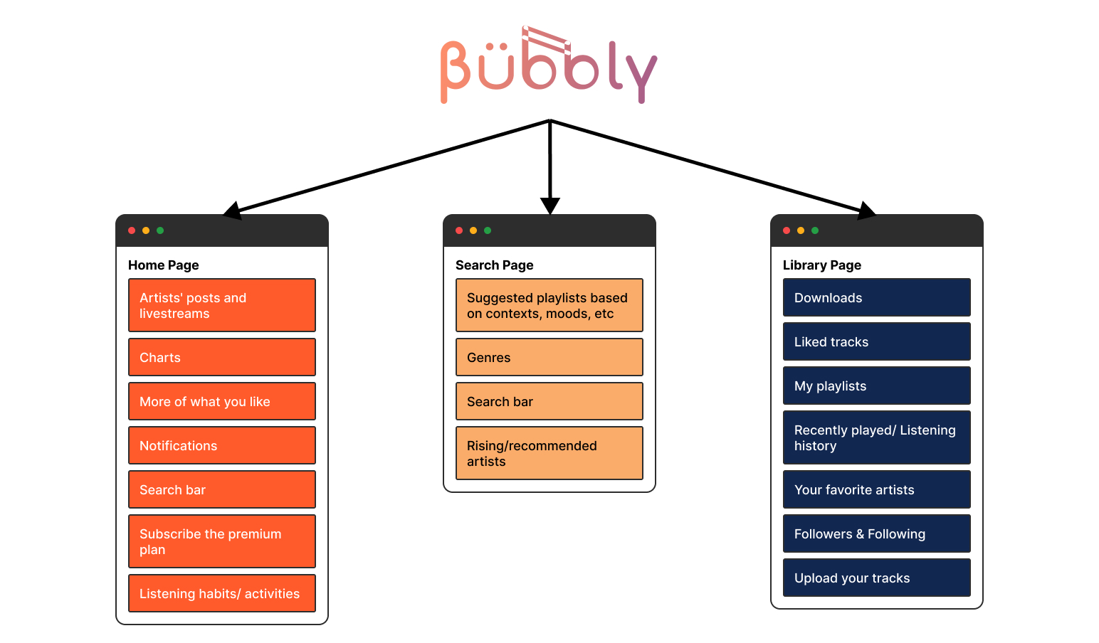
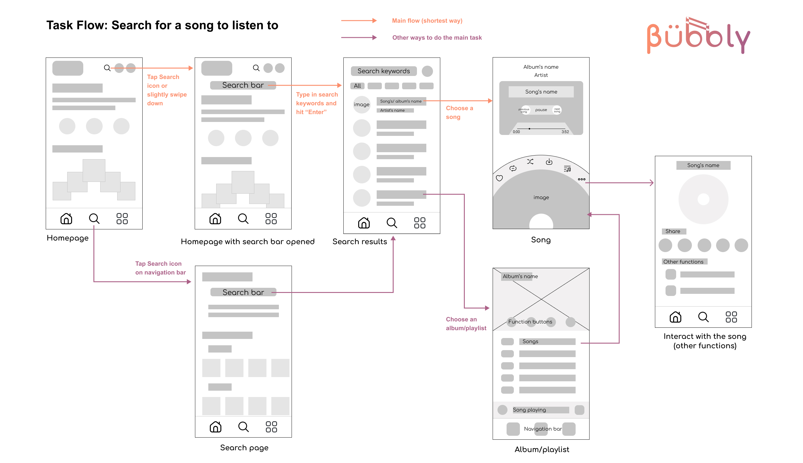
I conducted a card sorting exercise for the information architecture of the new app and got started with wireframes early on as they were the backbone for both interface and interaction design. I still followed the wireframing process that I’m used to: coming up with as many ideas as I could, asking people to do paper prototype and give feedback, refining and finalizing the sketches. I tried to be creative with the layout while still considering the best option to simplify the main user task, which was demonstrated in a new app flow.
3. UI Design & Interaction Guides
Different from my previous redesign project, this time I wanted to create a completely new app with its own features, just relying on an existing app to avoid the design problems it has. Therefore, I built a rebranding plan for my music streaming app with potential brand names, a new logo, and a different style: half-modern half-retro. Bubbly is the result of my rebranding research.
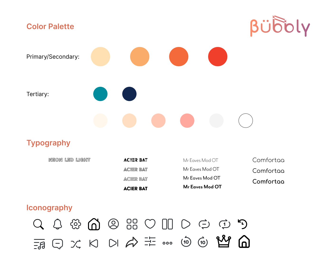
Although UI design wasn’t the main focus of the project, I still tried to put as much effort
into it as it should get. I was struggling with colors this time. In the interface of a
streaming app, there is a variety of colors coming from albums and songs’ images, thus the
background color of the app has more responsibility for creating color contrast. At first,
I chose a cream (or pale yellow) color for the background; however, it turned out not the
perfect choice and a dark color would create way more contrast as I tested different tones.
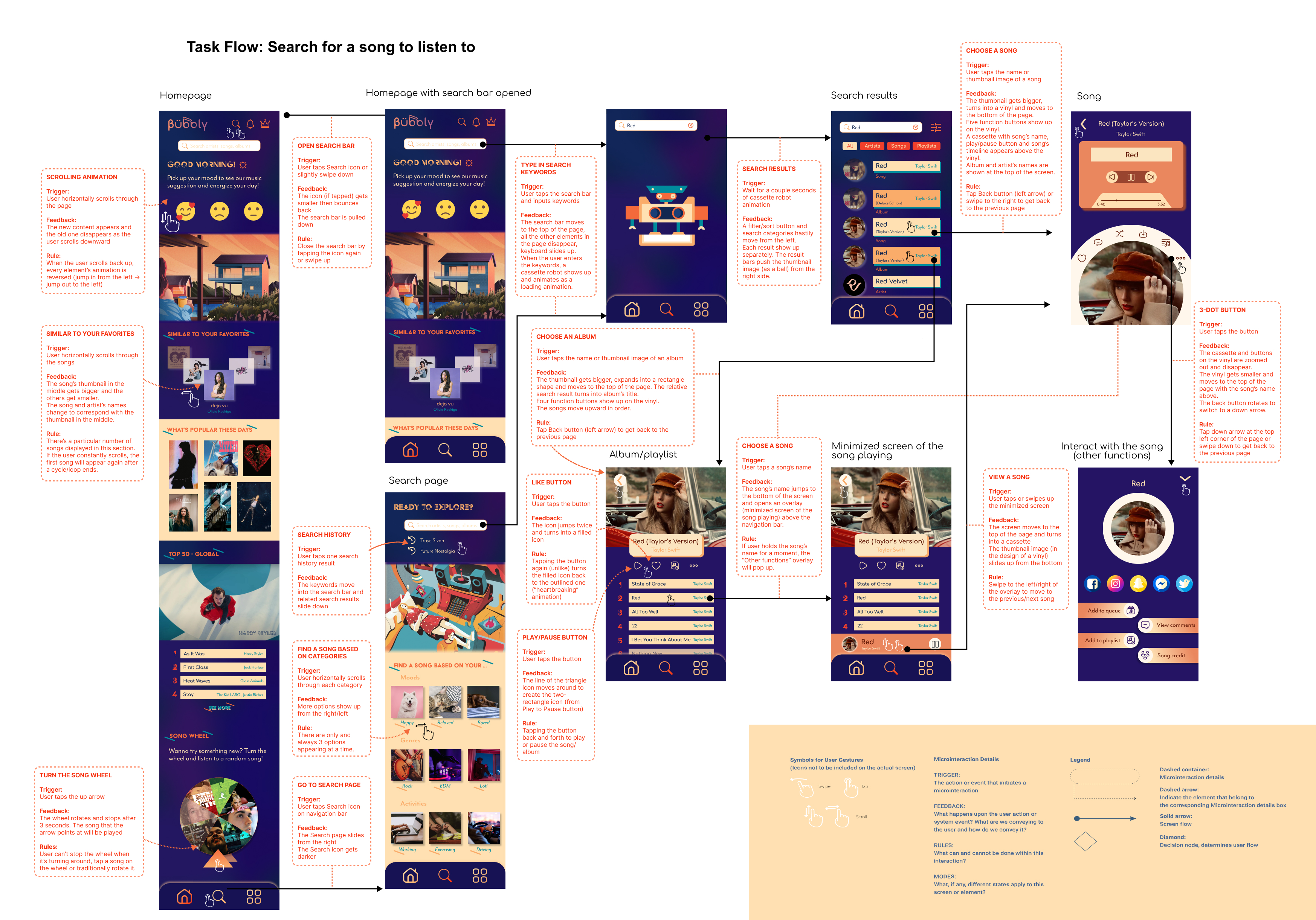
Next, I laid out an IX flow for the app with four parts: Trigger, Rules, Feedback, Loops & Modes.
It acted as a detailed guideline for my interaction design later on.
4. Interaction Prototype
Before jumping into the most important phase of the project - interaction design, I sketched all the animations out on paper. More than just a task flow, my sketches visualized the desired microinteractions: How would this icon be bouncing and jumping around after I clicked on it? How long would the movement be? Would the icon’s design (color, size) change throughout the interaction?
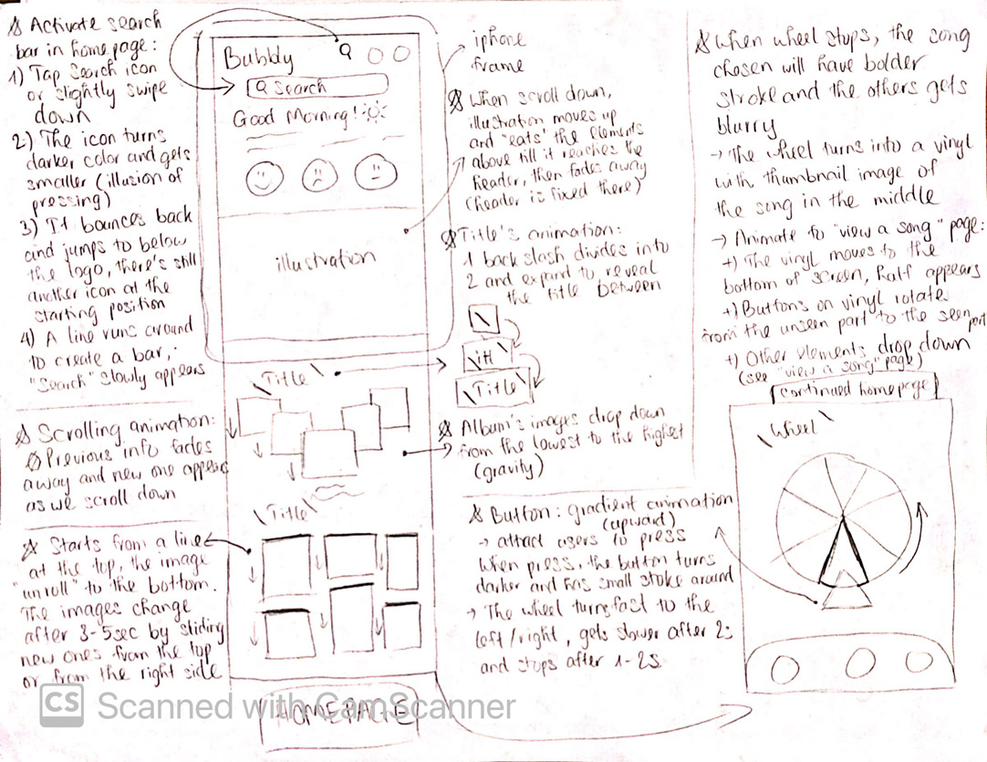
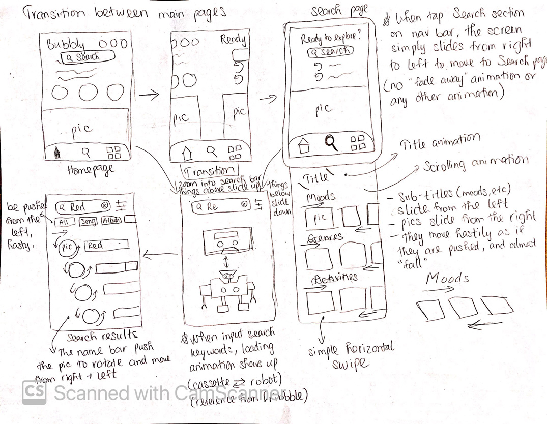
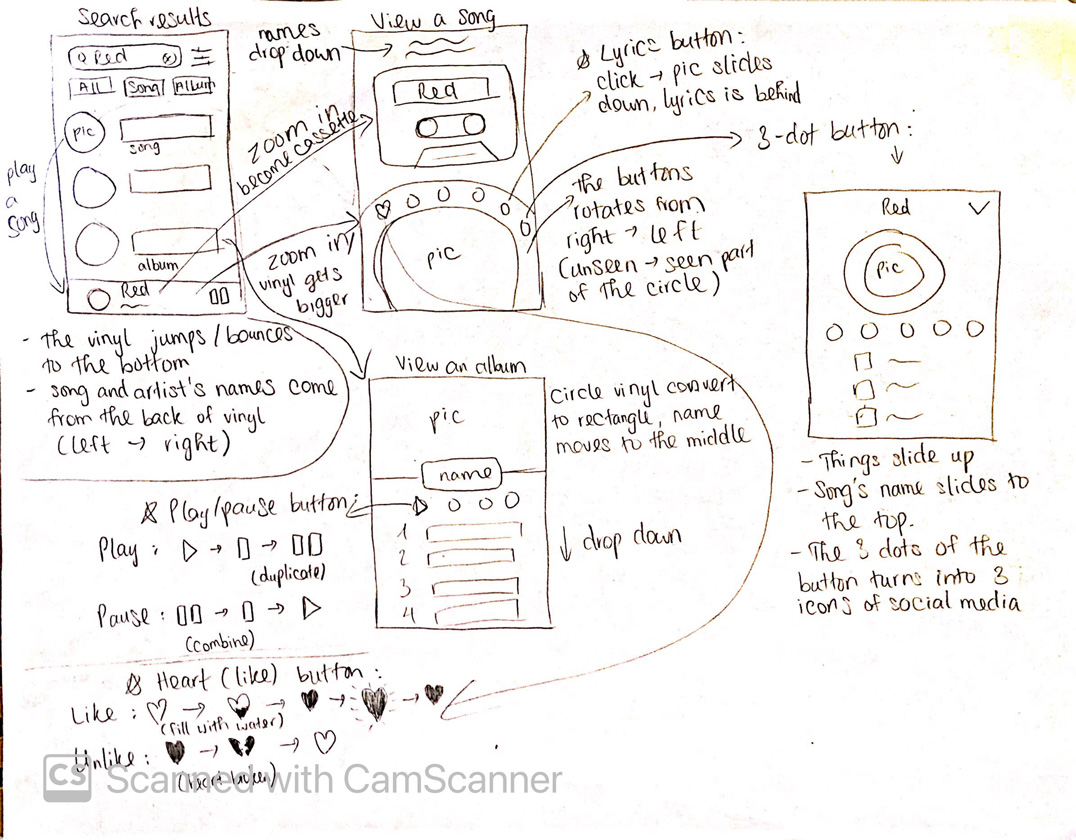
For this project, I didn’t create the interaction prototype on Figma but Adobe After Effects, which allowed me to design much more complicated animations. The process was hard at the beginning as it took some learning curves to understand the basics of After Effects. I was watching tutorials and working on my animation simultaneously. What took me the most time and effort to complete was the scrolling animation in the homepage. Other than a regular scrolling, I desired to animate how the content at the top of the page would move out of the screen and the new one would come in as the user scrolled down. This was a challenging but worthwhile process since I gained a lot of lessons after that.
The end result of the project is the interface design of the app and an animation video of the app prototype. Despite getting good feedback from my professor and classmates, I would say there are still some flaws in my design. However, as the first time designing interaction, it was still a valuable experience to me, and what I learned from it will set the base for my future projects.
